29 Jun 2012

World Wildlife Fund.


For one of my university subjects we had to design and make a poster for the World Wildife Fund using only Adobe Illustrator. It had to contain three drawn animals, a graph, a re-drawn WWF logo, and at least 100 words of text. My text was taken directly from panda.org with the information for the graph coming from animalinfo.org.

'Illustrator WWF poster'


When drawing the zebra I had a bit of a Martin Sharp moment and drew a ‘vivid zebra’.

'Vivid Zebra'

28 Jun 2012

Typography.


In the beginning few weeks of my university course, GemmaO’Brien came to talk to us. Gemma, who works primarily through typography, was hugely inspiring and following her talk I began to experiment with hand-drawn type.
I more recently attended the Sydney Semi-Permanent conference in 2012. Luca Ionescu, another typographer, gave a presentation and so, following that, I did some more experimentation.
Here are some of my favourites – The Intrepid Antelope was what I was thinking of calling this blog for a while, I’m glad I changed the name though!


27 Jun 2012

Lauren Child inspired.


 One of my favourite illustrators is Lauren Child. I like her simple, naïve style and her use of collage-style elements. I experimented with her style through these images of Juno, Sweeney Todd, and a made up character I called ‘Super Tim’.

'Juno 1'

'Juno 2'

'Sweeney Todd'

'Super Tim'

20 Jun 2012

Boys.


Because I tend to draw girls I experimented with drawing boys. These are (very roughly!) based on Ben Whishaw, Jim Morrison, and Goethe, a unique combination to be sure.
'Ben Whishaw'

'Jim Morrison'

'Goethe'

Ghost girl.


Here is another one of my favourite drawings – Ghost girl.
Ghost girl

Girls.


Here are three drawings of girls – the first two are imaginary, the second and third are inspired by the book Secrets by Beatriz Martin Vidal, and the third is from a clothes catalogue.


Parts.


I frequently draw portraits and so often practice drawing specific elements of the human face and body. Here are some pen and pencil drawings.


17 Jun 2012

Boy and girl.


A couple of years back I watched (and loved and re-watched numerous times) Hunting and Gathering. Here is a drawing I did of Guillaume Canet from the movie, although the resemblance to him isn’t very strong.

The pen drawing is of the girl on the cover of frankie magazine’s Issue #23 from May/June 2008.
'Guillaume Canet'

'Frankie lass'

Futurist Penguins.


Here are some previous pen drawings, drawn with a simple blue biro.

The first is a single-line drawing of a penguin, and the second I found in an old science notebook – clearly I found learning about the Italian Futurists in art class to be much more interesting than whatever we were doing in science class!
'Penguine'

'Italian Futurists'

Previous work.


A couple of weeks ago before properly starting this blog, I went back and flicked through a folder that I started four of five years ago that is filled with my old drawings. I was pleasantly surprised by what I saw there and so, with the help of my brother, I scanned in a select few of my favourites. Some were just quick doodles, others were sketches for larger works.

The first, posted here, is one of my favourite illustrations I’ve done so far.
'Connected'

'Back of Head'

'Ice Cream Girl'

14 Jun 2012

Spatial design.


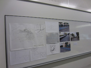
The final project for my other studio class was to pick a specific site within my university, and, having analysed it through applying ‘Goethean scientific methodology’, improve it.

My space chosen was effectively dead space, a place where no one felt welcome to relax or to meet, and a place that lacked suitable seating despite being well positioned as a mid-campus ‘pitt stop’.

We were to undertake an iterative process and to develop our ideas specifically through model making.

My key aims were to provide: seating, a welcoming area, and shelter.

My first model provided bench seating as well as a ‘wind shield’ due to the area often resembling a wind tunnel.


Moving on from that I created an Olafur Eliasson-inspired tunnel to make the path nearby more interesting and engaging. Thus tunnel also came about due to Paul Jackson’s 2011 book Folding Tecniques for Designers: From Sheet to Form.


Moving away from that idea, and after experimenting with folded cardboard I formed this shape.


When I moved the two side elements of this design around I noted its resemblance to a moth and so decided to enhance this. The lines in the ‘wings’ were experiments for in-built seating.


From the moth idea came the notion of having a light bulb moment, yet initial drawings of a giant light bulb monument revealed this to be impractical. Nonetheless, I liked the idea of creating some kind of sculptural form along with seating.


I moved away from cardboard and began to experiment with geometric forms and balsa wood.


Yet I still wanted the area to be practical and so I returned to a simple bench seat with a cover.


I then combined these ideas, albeit in a chaotic kind of way.


I once more returned to the idea of benches and created two variations.


From this I formed a frame with sheltered areas. With this formed, I experimented, again, with types of seating.


I was pleased with the frame and so built a copy on which I attached the reclining seats of the final model. This model provides seating and shelter while also being site-specific within the university and due to its placement outside a bookshop, as the frame and shape of the seat reflects the shape of an open book.


And finally, here are the presentation boards displaying an A1 abstract spatial analysis, photographs of the site, plans, elevations, sections and renderings of the final design.


Helmet.


My final project for one of my studio classes was to design a ‘protective helmet’ that would fit my own head and be made entirely out of polyhedron formed from 80gsm paper. Glue could be used although only for connections and certainly not to strengthen.

My design was for a train helmet, theoretically aimed to reduce the noise one hears whilst onboard a train, and provide camouflauge. In order for the latter to occur I used only photocopy prints of Sydney’s current train map and various mx newspapers.


After completing our presentations we voted within our class in response to specific criteria. Mine was given two votes for concept, two for the use of materials, and 1 for ‘amusement’.


Spaces drawings.


My second university project was to produce twelve A4 drawings (they could include some watercolour) that explored the impact of sites from memory, university and the city, upon myself. However, I misinterpreted the brief somewhat and was overly dependant on watercolour to communicate and to convey the sensorial experiences.

Here is the set of twelve drawings (again, please excuse the background):


Despite the images not exactly following the brief, I do like the following images. Note that not all images were presented in the final set, the drawing of Utzon’s Sydney Opera House, and the final image were drawings produced in the process of creating the assignment. [special thanks to http://thespellofwakinghours.blogspot.com.au/ for the professional scanning assistance!]